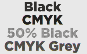
1 Color Black Text vs CMYK Black Text
#000000 ≠ 100% K
1 color black vs CMYK or 4 color black is a frequent topic of conversation with clients and designers we work with. When it comes to commercial offset printing it is important to understand the difference between the colors and when one should be used over the other.
CMYK
Offset and digital presses print using a build of CMYK – 4 colors which stand for Cyan, Yellow, Magenta, and BlacK- When combined these colors create a full color-spectrum to build text and images you see every day on brochures, pamphlets, books, etc.
*que the music – “This is how we do it” …

To print in full color, offset presses build a series of dots using CMYK process colors. On our Komori Offset Press, your artwork is imaged onto 4 separate color plates, 1 for each of the CMYK process colors. The plates are aligned precisely then paper is sheet fed quickly through the press as each plate imprints its series of dots to recreate your artwork.
So, when your designed piece incorporates black or gray text using 1 color black is the optimum choice.
Let me elaborate…
When designers choose a font color they select a color off of the color palette or input percentages for each CMYK color. When all 4 colors are used to build BlacK it requires the use of dots from each plate on the press to reproduce the text.
4 color black
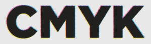
If the text in your artwork is a build of the CMYK process colors all plates would need to stay in perfect “registration” to print clearly, which can be a difficult process for small fonts. Registration is a print term referring to how well the 4 colors align. The image above is an example of what it looks like when the press is out of registration.
Note: 4 color black text printed out of registration is more visible with small type. When CMYK text is out of registration it makes it harder to read, and leaves a soft appearance around sharp edges.
1 color or 100% K

On the contrary, if the text in your artwork uses only Black ink then only 1 plate will be used to reproduce your text and the other 3 plates will not need to be aligned. This results in visually clearer and sharper text.
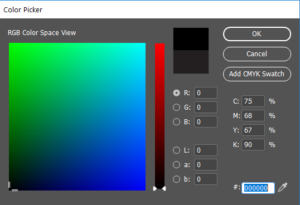
*This image illustrates the difference between 100% K and #000000… The black on the top is what happens when #000000 is translated to CMYK. It makes a rich build of CMYK instead of a 1 color K shown underneath.
The Exception
There are certainly times when a designer may want their BlacK text to be richer so they chose to build the CMYK process colors rather than 1 color black. 4-color BlacK is built using percentages of all 4 colors within the CMYK color palette and is often used for large areas of BlacK. Our suggestion for building a rich black is to use a mix of 40% Cyan and 100% BlacK.
However, in some cases designers accidentally choose a BlacK that is built with more than one color instead of inputting 100% for BlacK. There are also cases when art work is designed using RGB colors and when transferred to CMYK it does not convert to 100% K. #000000 does not equate to 100% K as illustrated above. For this reason, we feel it is an important subject that needs to be addressed.
Advantages of 100% K
Ultimately, 100% or 1 color BlacK prints more clearly. As I mentioned previously, paper is individually fed through an offset press at high speeds and each plate must line up perfectly to reproduce your artwork. Only using one plate for black or gray text leaves little to no room for error.
At the end of the day…
It is our responsibility to ensure perfect print registration every time and we do a damn-good job at it but think about this. Building black with CMYK process colors requires the use of dots, reproducing small letters with sharp edges using dots is like making a square out of tiny circles… catch my drift? With 1 color BlacK as illustrated above there is no need for dots so letters with sharp edges print clearly.
To eliminate the possibility of blurry text we suggest using 1 color K for all black and gray text. Doing so also has an added bonus because there will be no wasted time dealing with reprints. Just clean cut sharp looking text, a beautifully printed piece, and our favorite of all… a happy press operator.