Process vs. Spot Color
Cyan, Magenta, Yellow and Black are the colors that make up Process Colors. In theory, we can make all the colors of the rainbow using these 4 colors. In reality, that’s not true. There are RGB colors that do not convert well to CMYK and there are some Pantone (PMS) colors that also don’t convert well to CMYK.
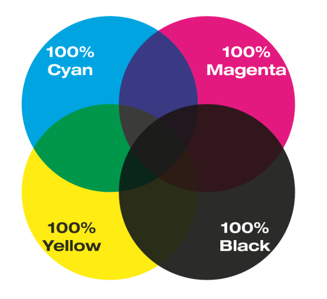
Let’s look at how CMYK colors mix to make other colors. The graphic below shows solid, 100% of the CMYK Process Colors interacting with each other.

This next graphic shows how 50% of those colors interact with each other. Notice the rosette dot pattern where the colors overlap. This is what makes it Process Color.

Here is a closer look. The cyan, magenta, yellow and black dots all come together to give the illusion of multiple colors. This is how process colors work.

Now let’s talk about Spot Color.
Below are two circles, filled with spot colors, set to “darken,” so that they create a third color in the middle. This image only uses two spot colors.

Here is a zoomed in shot of the solid colors.

Here are those same two spot colors, converted to process.

Notice that the color is not exactly the same as the example using spot color. This is one concern with spot colors. Say you have letterhead printed with your logo in spot color and you want to print a brochure with your logo converted to process, how well will it match? This is something to be aware of when choosing spot colors. How will they work for you in the long run? You also need to consider how your colors will appear in RGB on the web, but that’s another subject.
Here is a zoomed in image of the spot colors printing in process. Notice that all the dots are cyan, magenta, yellow and black, making up a somewhat close representation of the spot colors.

If you have any questions about how your colors are going to print, call us at 727-572-9999. Someone will be glad to help you make the right decisions for your colors.